Are you going to start your business as a SaaS? Have you got an idea and now you want to settle up your website, but you’re not a graphic designer? Start here by creating your Visual Identity Book.
Why it is so useful? It will help you to smooth your website, make your SaaS recognizable, will be handy for preparing presentations, advertising on the Internet, or social media e.g. Facebook, Instagram, Twitter. Would it be comfortable to keep all branding graphics in one place? For sure, but is it not a waste of time?
Too many questions above. Now let’s make some answers. Visual identification is the basic tool for creating the company image on the market. You may view thousands of websites and some stayed in your mind. That means the graphic designers done a good job. There are some rules by which you can create a consistent look for a brand. Basic visual identity consists of features like: logo, colors, font, icons, and pictures and all these elements give a consistent look to the website. Collect them in one place called Visual Identity Book. This book will save you a lot of time, and your co-workers will know how to properly engage in building a website and strengthen your brand recognition. All this will ensure that the prepared content (and tutorials, advertisements, graphics, charts) will inspire trust, positive perception of users, and the message will be uniform.
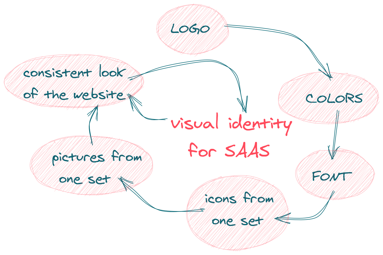
You can achieve effective visual identification on your website with these steps:
Creative work
Some creative work to do. Try to imagine your service with a miniature or with one tool, thing, object. Scrawl a few pages to find that one you will identify (including an abstract spot) or… look for some inspirations on the Internet. The best way is to prepare your logo in vector so you can use it in many materials, advertisement, website. You just can scale it, vector graphics need less space for storage. It will make website loading faster. Search similar projects, compare or try logo generators e.g. (but for most of them you have to pay). An easy way is to use a free, unusual font and give the name of your business. An example is saasitive.com, where we used two different fonts:
![]()
Colors
Think about colors. For sure You will do some labels, templates, differ parts of your website, icons, buttons. Use a color palette to chose a few of them and to be sure it won’t be too radical or too mismatched. If you do not feel confident in choosing colors, use ready-made color palettes (take a look at Coolors where you can inspire). The aesthetic selection of matched colors to the website and its content can create a good impression and a sense of polished appearance. When mixing colors, designers use the 60-30-10 rule, which means that 60% fills up main color, 30% the second and 10% the third color, used mainly to emphasize and highlight important elements. This is only a suggestion, but it can prove useful if you want a colorful page while still being readable and clear.
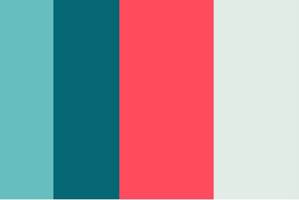
For our website we chose:
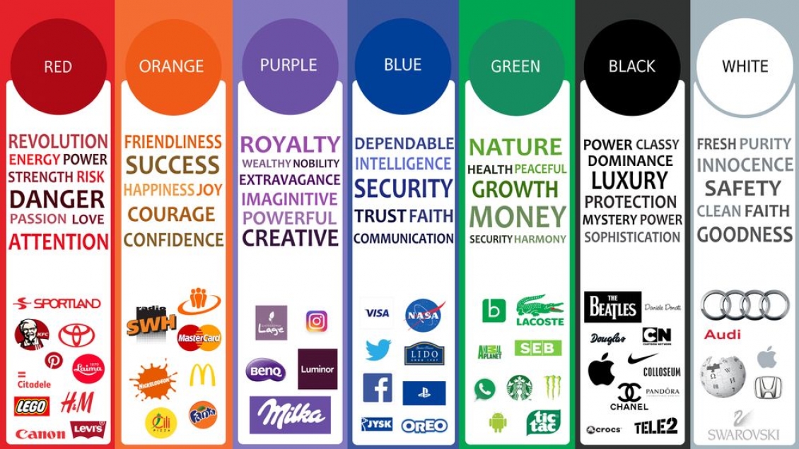
Psychology of the colors has a big meaning. The most preferable color by woman and man is blue while disliked color is brown and orange. Men prefer saturated, darker colors, they also accept gray tones. Women like lighter and less saturated colors, gray is not their favorite shade.
Take a look at the graph below it shows the meaning of colors. As you can notice each color gives a variety of impression and can be addressed to a different group of people (from https://www.firstdesign.eu/the-meaning-of-colors-in-design ):
Font
Find a font that suits your website. Pick at most 3 fonts. You can use only one font in different sizes and types (bold, italic). If you need special signs check it out whether font provides them. Font color is also important. Usually, we use black but for example, headings can be in one of your chosen colors suitable for the logo.
Aa Bb Cc Dd Ee Ff Gg Hh Ii Jj Kk Ll Mm Nn Oo Pp Qq Rr Ss Tt Uu Ww Xx Yy Zz 1234567890!@#$%^&*()<><>?|\,./
Icons
Choose icons that can describe features of your SAAS. The best is to use a wide set of uniform style icon where you have a lot of variety to choose from. If you choose colored icons remember about the colors of your brand. You can check Uxwing , aiconica, Iconfinder, or Flaticon. Remember that each icon has its license to use so read it to know how to use it for free. Sometimes it’s better to pay (the cost is not that big) to have a clear conscience and use a whole set of icons. Some platforms don’t require attribution. Examples of icons monochromatic:
![]()
Pictures
Pictures used on the website should correspond with the content on the website and icons (if you chose monochromatic icons pictures can bring some pleasant impression). There’s a lot of stock of photos you can choose from. You have to find out what will arouse the curiosity of the user and will be a sneak peek of your article, tutorial, essence feature you describe, or action you encourage users to do. You can check Undraw where you can get nice vector pics and change color so it will suit your website. Example from SaaSitive:

The devil is in the details.
Prepare a favicon. Don’t forget about it, it’s a little stamp on your website placed in the browser. Use the first letter from your brand name, logo, or a sign which will be memorable. That’s a little detail but necessary! If your users have a few pages opened in your browser they will find your webpage with this tiny sign. It needs to be square 16x16 pixels, but you can start from 64x64, and after it’s ready then resize it.
You can just try to use generators like Formito.

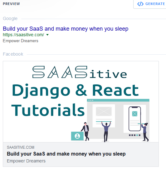
Want to share your website on social media? You better prepare a metaimage. It consists of an image with a title, a short description, and the domain name. It should have 1200x630 px. You can check how your graphic will look at Metatags. Let your users share articles, tutorials from your website by giving a link with an expressive picture. It could looks like this:
To be accurate prepare footer to e-mails which will be sent automatically. Use the chosen font and logo so users remember your visual identity. Include the address of your website, e-mail address, and other important information.
All adverts, banners and graphics you can do with well prepared elements above.
Summary
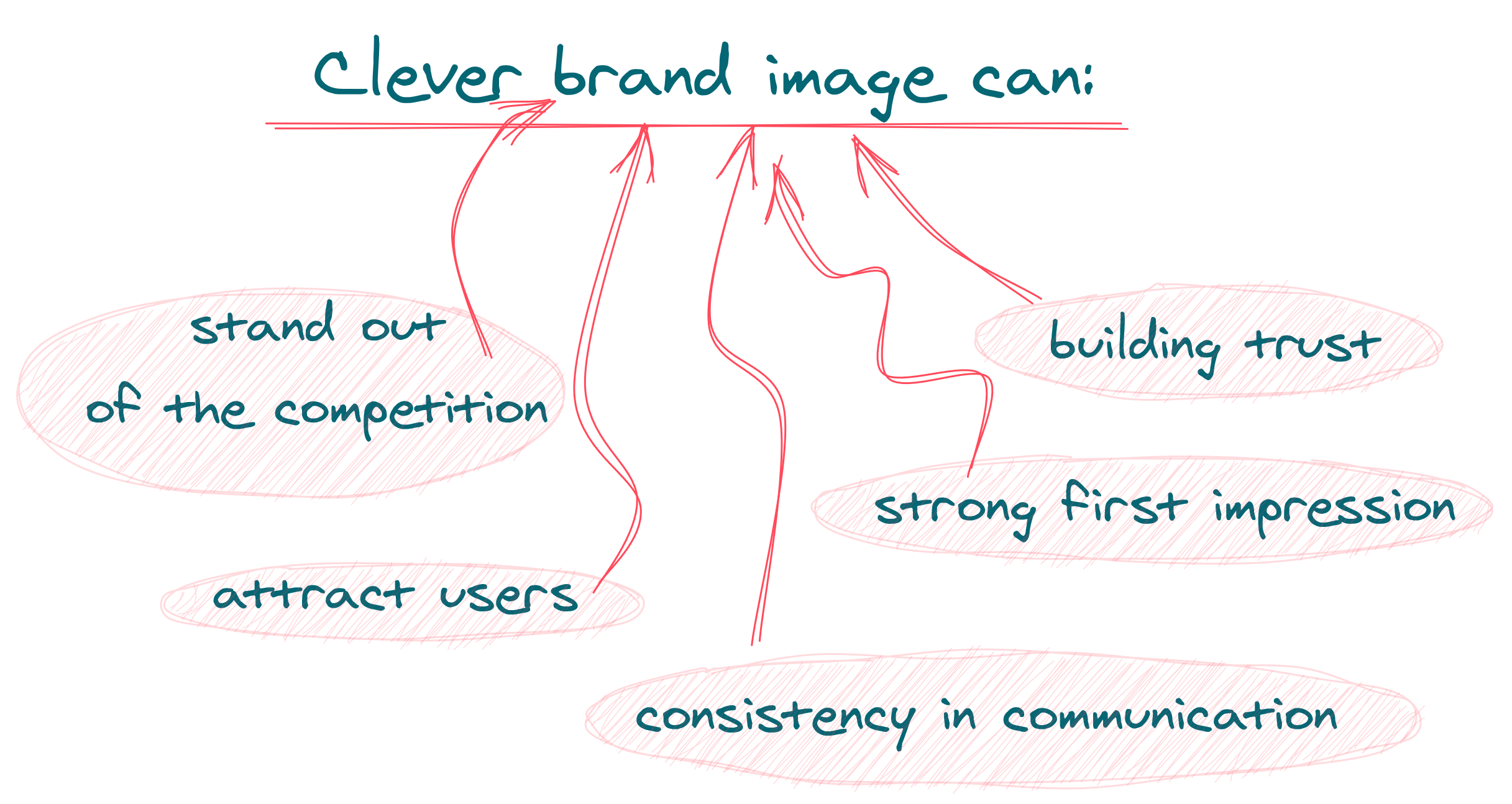
Preparing visual identification is a process in which you create a clever brand image. Using all hints above will help your SAAS to stand out of the competition and give a consistency in communication. Besides your website will give strong impression and build trust of the users and attract them.
Leading an internet business mainly based on advertisement, social media, GitHub, StackOverflow, and others. To advertise you need ready visual identification. Logo starts to be recognizable if you use it to promote, advertise your SaaS. First of all, you need to gather this information in one place to find it quickly. Create a folder and put all items listed below in it.
The minimum what your Visual Identity Book needs:
- company symbols - logo, logotype, decorative symbols (if it’s possible to try to make it also in black-white colors, in many combinations vertical, horizontal, and in few different sizes also keep the most used logo in different formats e.g. pdf, jpg, SVG);
- colors (describe colors in many options: RGB, CMYK and Hex Code, HTML - to find it use e.g. Rapidtables );
- company typography - font type and size;
- icons or pictures you will dress features, functions, or descriptions, or the content.
The rest you will compile with elements upstream.
You can check Visual Identity Book of SaaSitive in our repository. Let us know if it was helpful.
Let's stay in touch!
Would you like to be notified about new posts? Please fill this form.